LUFELY
Sector
Premium Aluminum Profile Manufacturer
Services
Logotype
Visual Identity
Year
2023
Country
Brazil

Elevating Brand Recognition through a Tailored and Cohesive Typographic Identity a Unified Brand Identity.
The studio translated LUFELY’s core values — technical precision, durability, and refined aesthetics — into a robust typographic identity that reflects the brand’s commitment to excellence in architectural solutions.
Inspired by the structural integrity and minimalist elegance of high-grade aluminum frames, the visual language was designed to communicate confidence, adaptability, and timelessness. Every element, from the typography to the layout system, was crafted to mirror the brand’s dual focus on performance and visual sophistication, ensuring a coherent presence across all touchpoints.


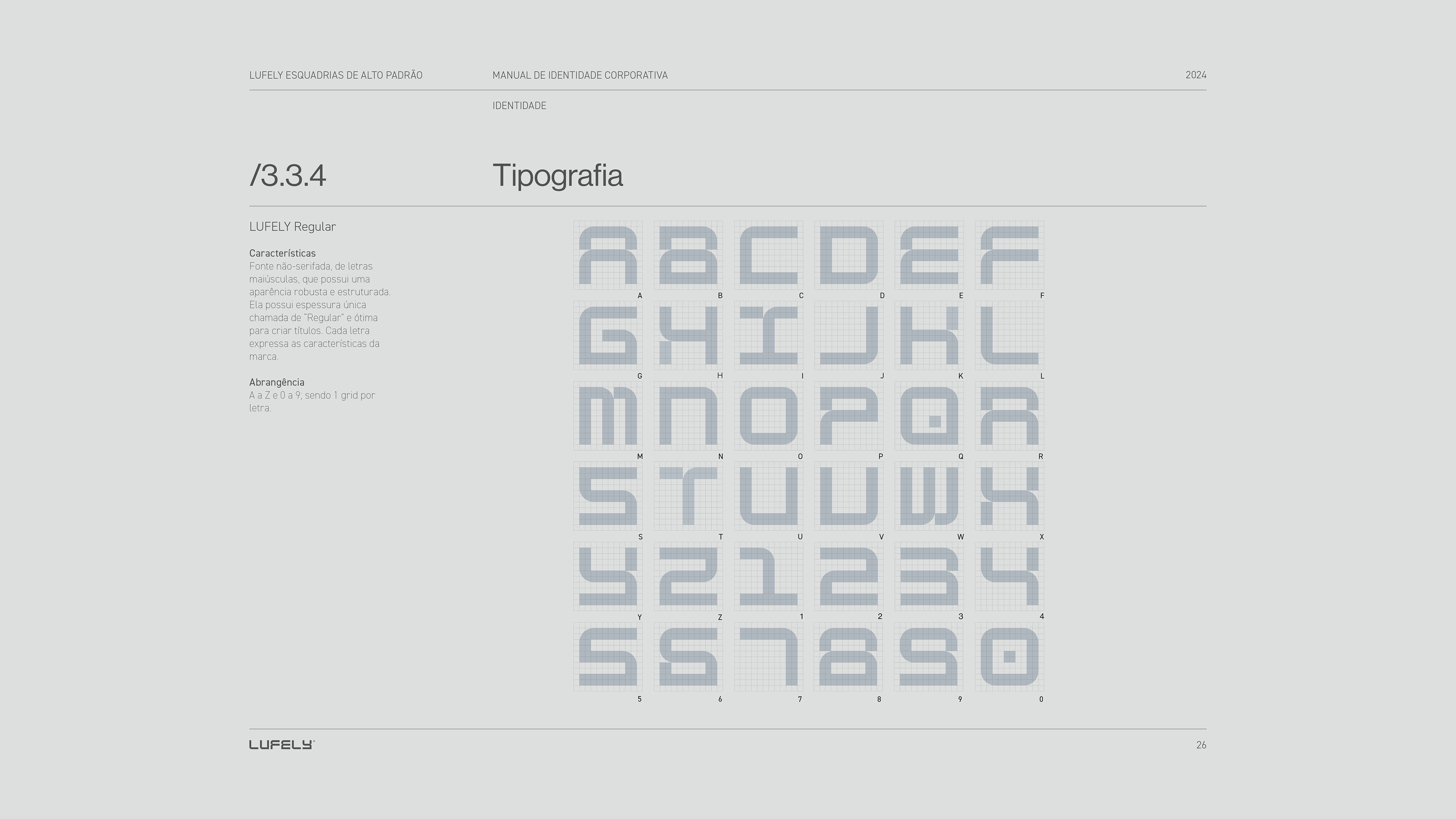
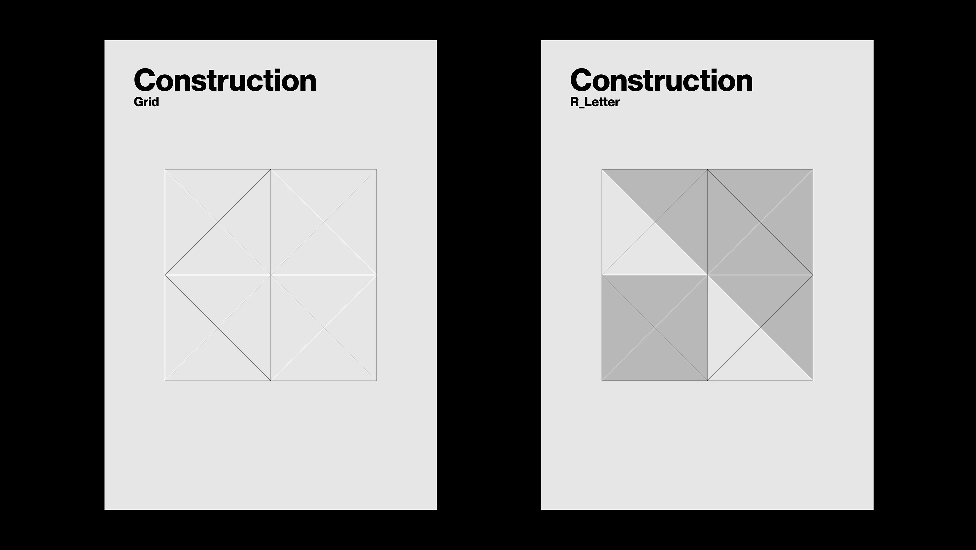
The proprietary LUFELY typeface was developed based on parameters inspired by the brand’s aluminum profiles. Its construction relies on clean, straight lines, guided by design principles drawn from fillet detailing and the tolerance standards recommended for manufacturing metal components.
To balance structural rigidity with visual comfort, subtle rotations and modular shapes were introduced, giving rise to versatile, foundational elements. This modularity ensures consistency in proportions and spacing, resulting in a typeface that is robust, well-structured, and visually coherent.