AKVA
Sector
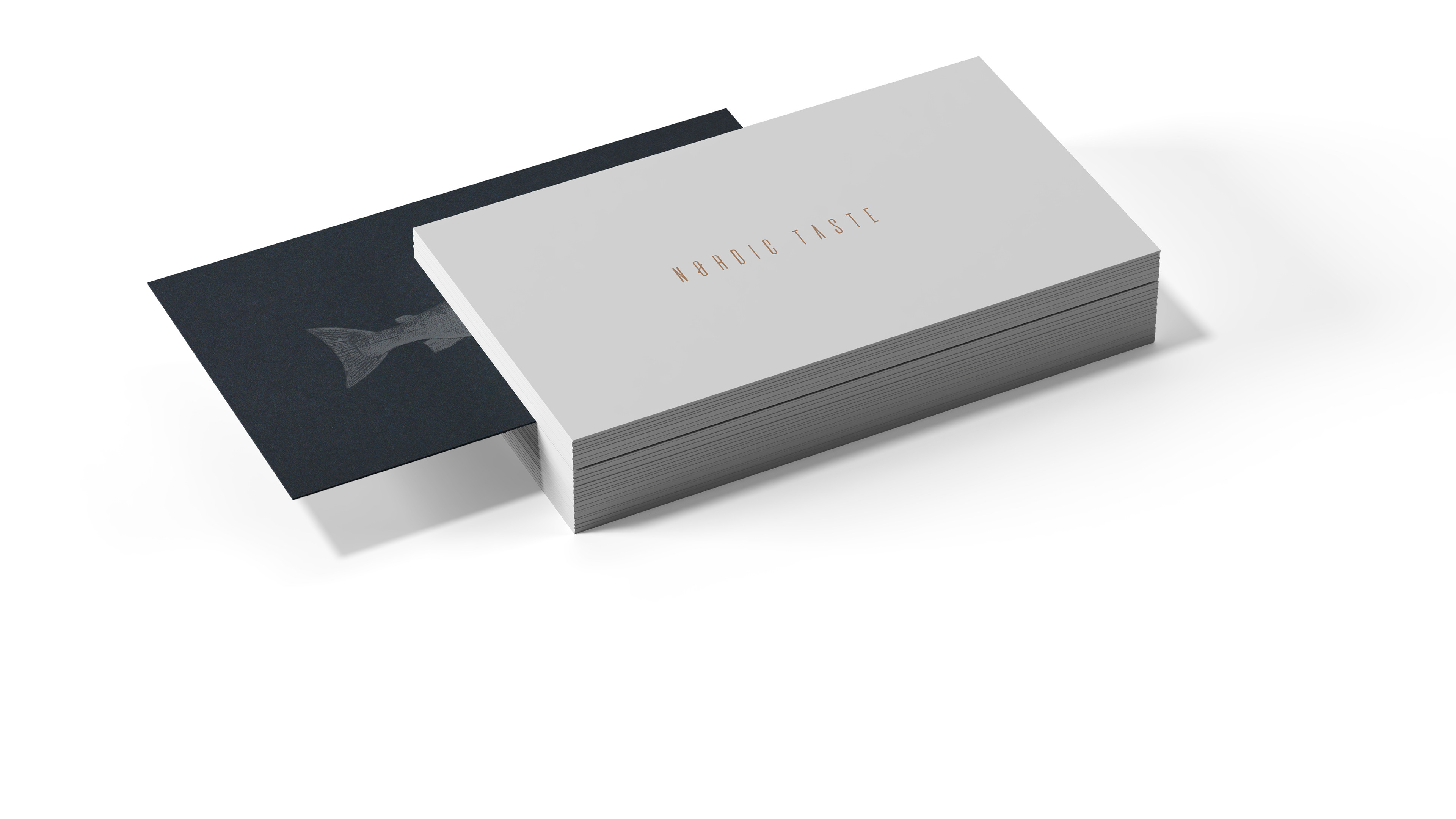
Signature Dining Experience
Services
Naming
Logotype
Iconography
Year
2022
Country
Sweden
A minimal and modern brand identity that honors Nordic roots through symbolism and refined design.
The main idea of the AKVA® brand is to present the "nordic taste", based on a minimalist aesthetic, typical of the architecture and design of nordic countries, without the need to resort to the usual cartoon elements, such as Vikings signals and extremely rustic environments. My graphic solution strategy has two axes: a modern fresh concept and the mysticism, without forgetting the history. The Web of Wyrd was the main inspirational tool and used both as a "grid" to support construction as well as "cradle", for accommodating the logo. As one of the lesser-known Nordic symbols, the Web of Wyrd is a symbol in Norse mythology that represents the interconnectedness of past, present and future. The symbol comprised of nine staves contains all the runes thus symbolizing all "the possibilities" the past, present and future brought and might bring.