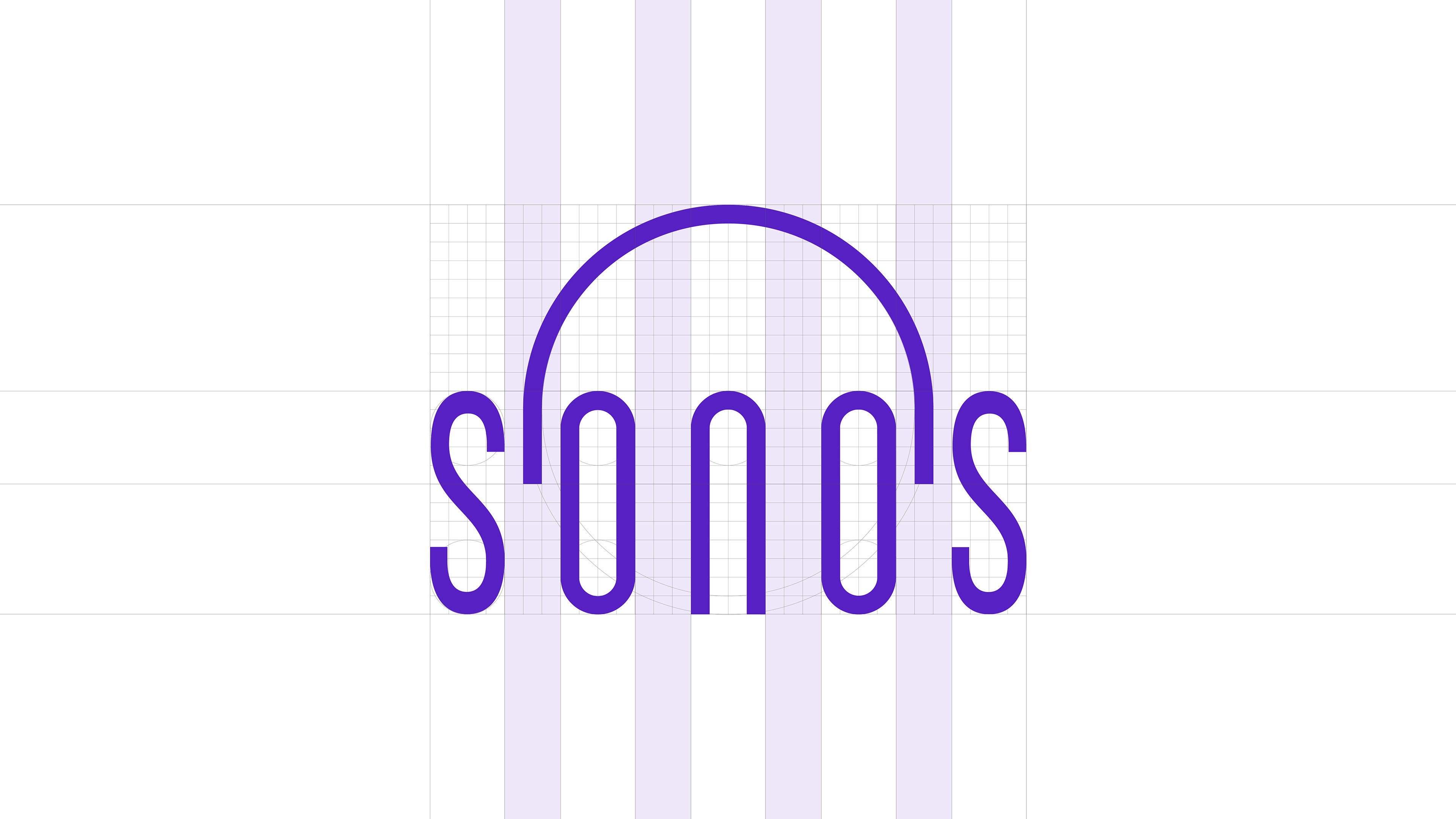
SONOS
Sector
Sound Design Studio
Services
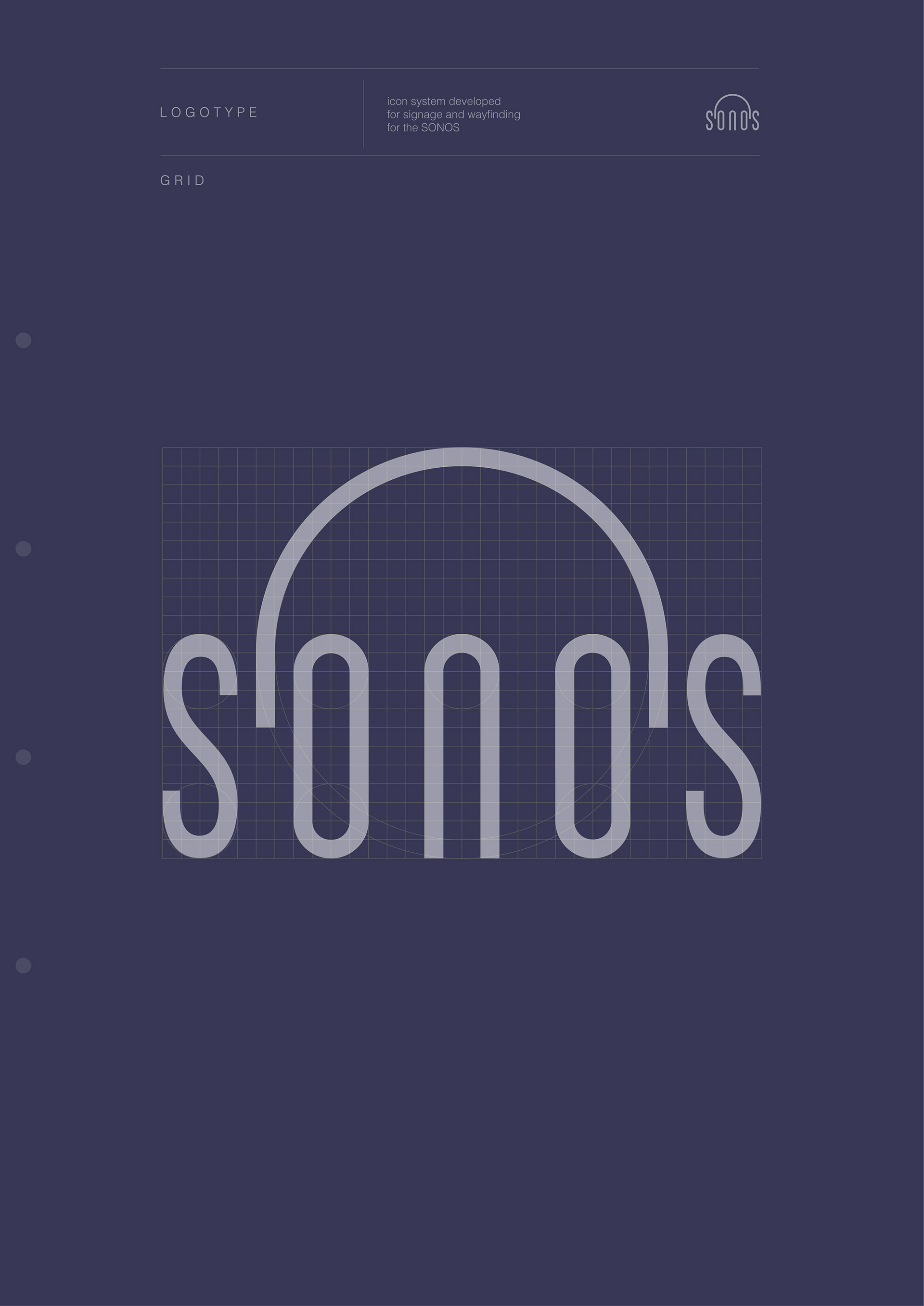
Logotype
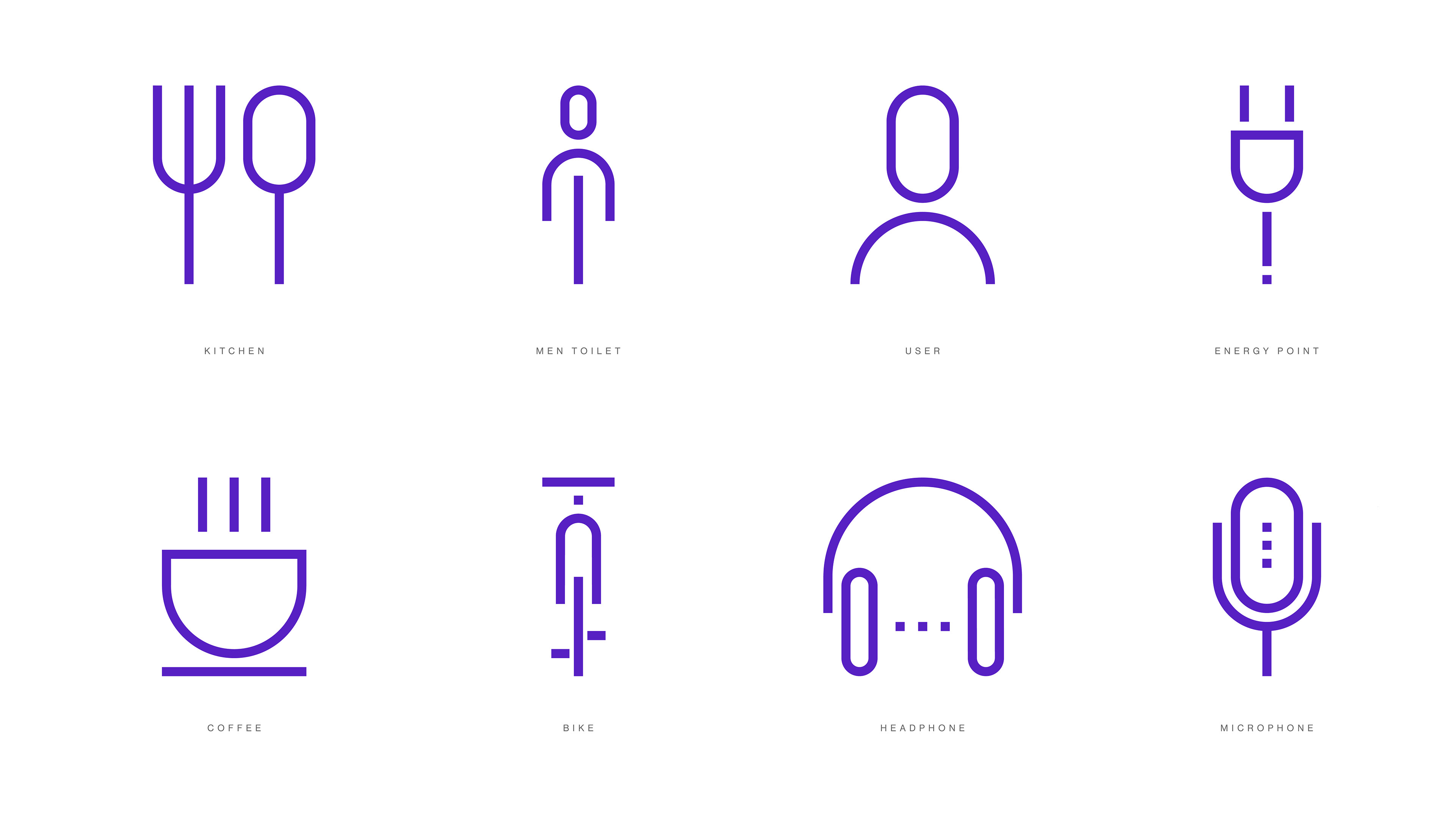
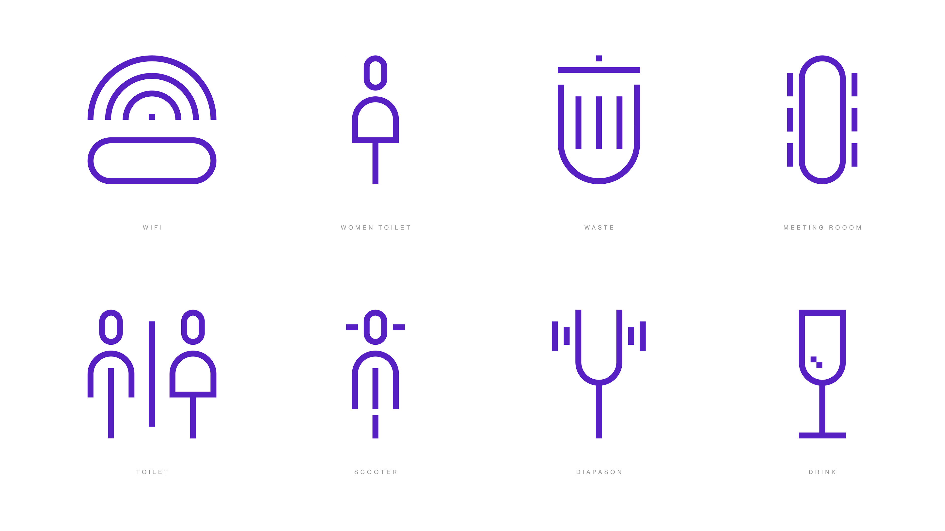
Iconography
Year
2022
Country
USA
A refined identity system
that translates the precision
of audio craftsmanship
into visual clarity and minimal design.
This conceptual project was developed for SONOS®, a boutique audio post-production studio renowned for its excellence in sound mixing and its close relationship with top-tier creative agencies. Known for its refined expertise in commercials, television, and digital media, SONOS® represents a perfect balance between technical mastery and artistic se nsibility.
The design challenge was to translate this legacy into a cohesive visual identity — one that communicates precision, innovation, and modernity without excess. A custom logotype and a vector-based icon system were developed to ensure adaptability across digital and print applications, from web and app interfaces to infographics and brand materials.
Inspired by the clarity and sophistication of high-end audio design, the icons follow a strict geometry, consistent stroke weight, and visual balance. Their minimalist construction ensures they remain functional, legible, and elegant at any scale, reflecting the studio’s commitment to clarity and creative excellence.
The result is a timeless and versatile visual language — one that enhances the SONOS® brand presence while maintaining the focus on precision, service, and innovation in audio post-production.
Icon content should remain inside of live area, which is the region of an image that is unlikely to be hidden from view. If additional visual weight is needed, content may extend into the padding between the live area and the trim area (the complete size of a graphic).
No parts of the icon should extend outside of the trim area. System icons use a consistent stroke width of 1 dp, including curves, angles, and both interior and exterior strokes.
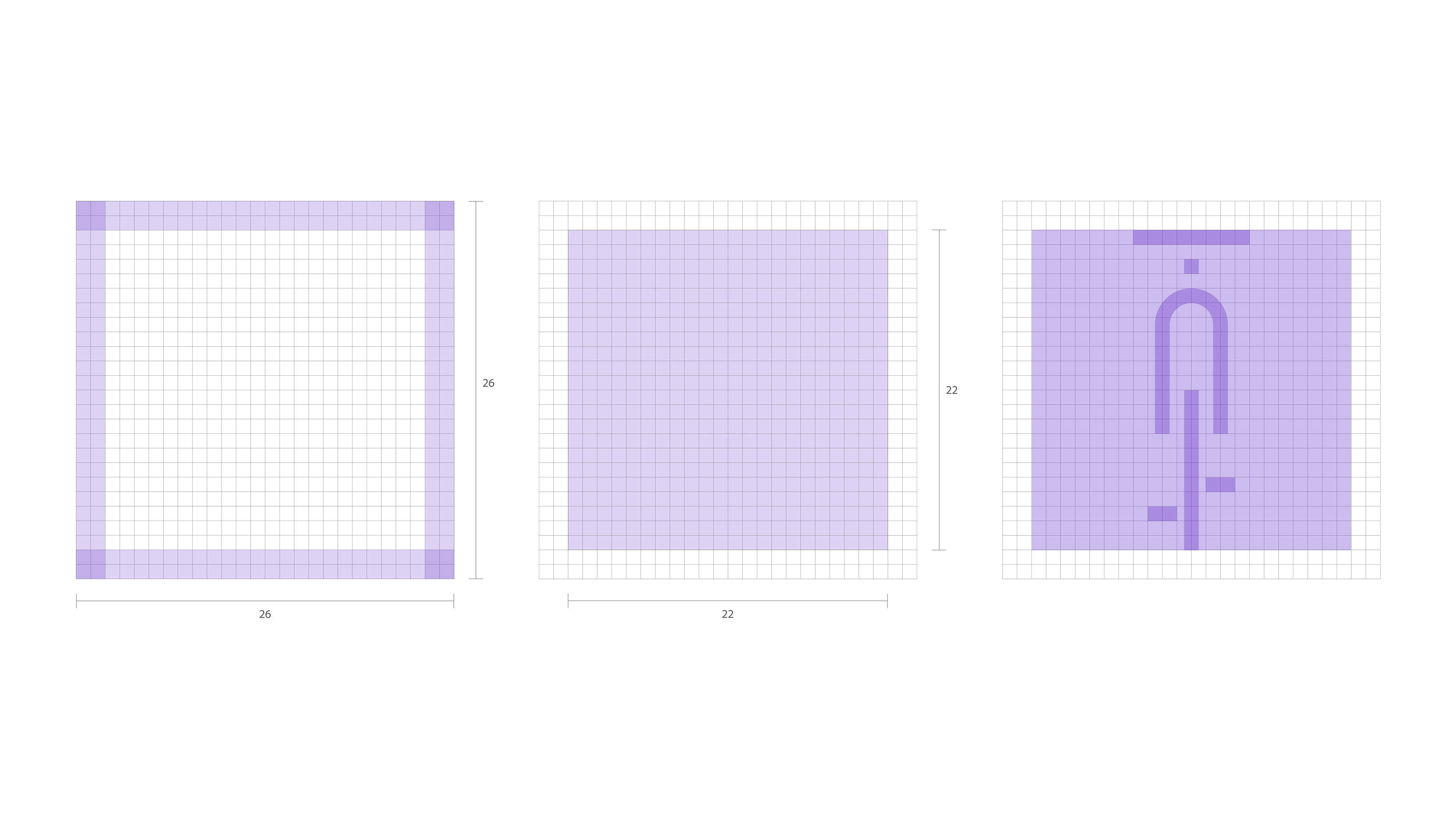
The shape of the icons uses lines derived from the logo developed for the brand. This connects the icon system to corporate design.

Microphone icon variations:

This set includes icons for signage, transport, navigation, people and private spaces.