weniger aber besser
Sector
Graphic Design
Services
Logotype
Iconography
Year
2022
Country
Brazil
Where less reveals more:
a conceptual project rooted in form,
balance, and intentional simplicity.
Weniger aber besser is a visual exploration rooted in the essence of minimalism. By distilling design down to its most fundamental forms, the project reveals how simplicity can carry depth and meaning. Every element is carefully considered, resulting in a composition that balances form, space, and intentionality. Through a deliberate and thoughtful approach, the project demonstrates that eliminating the superfluous can achieve aesthetic clarity that resonates deeply.


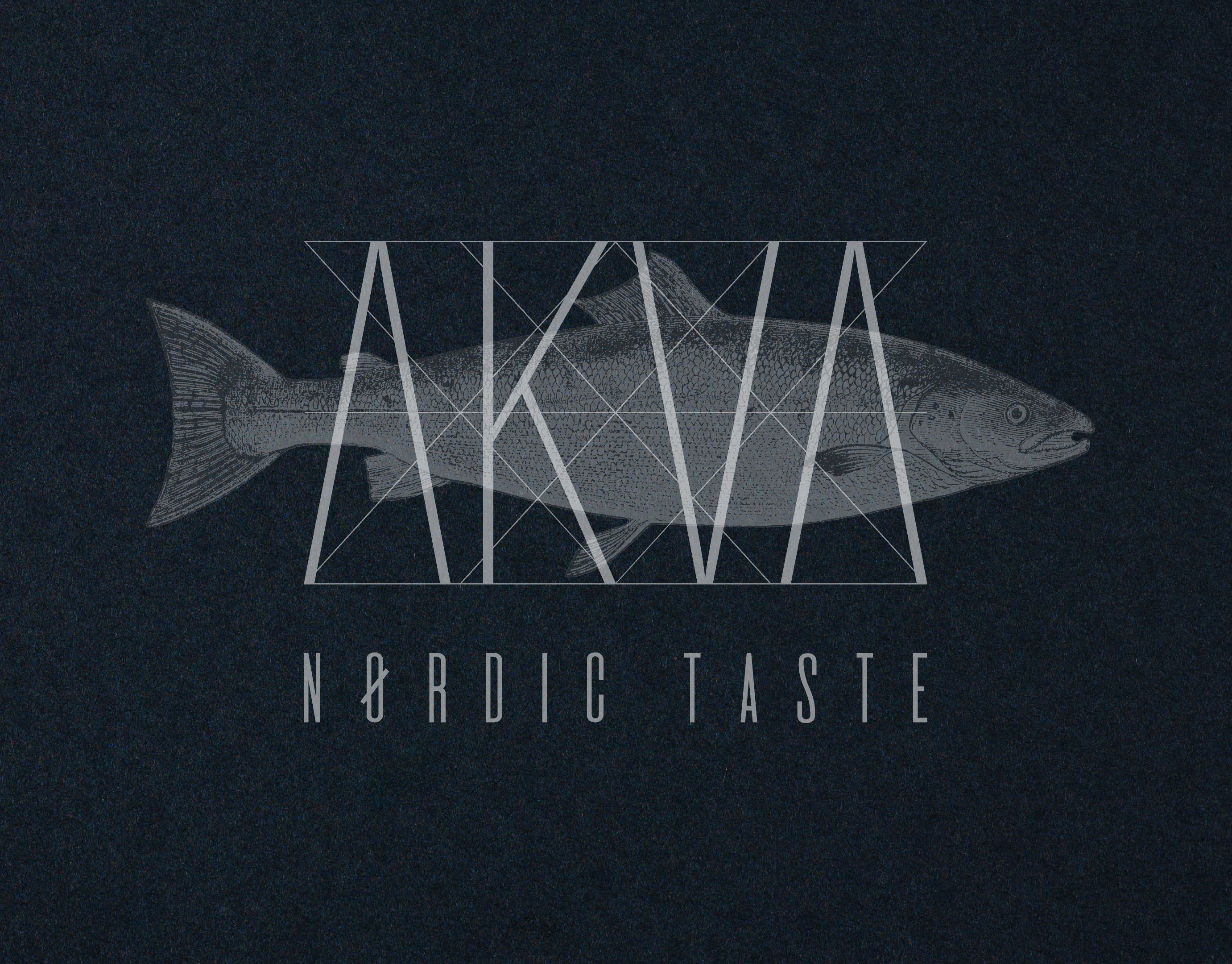
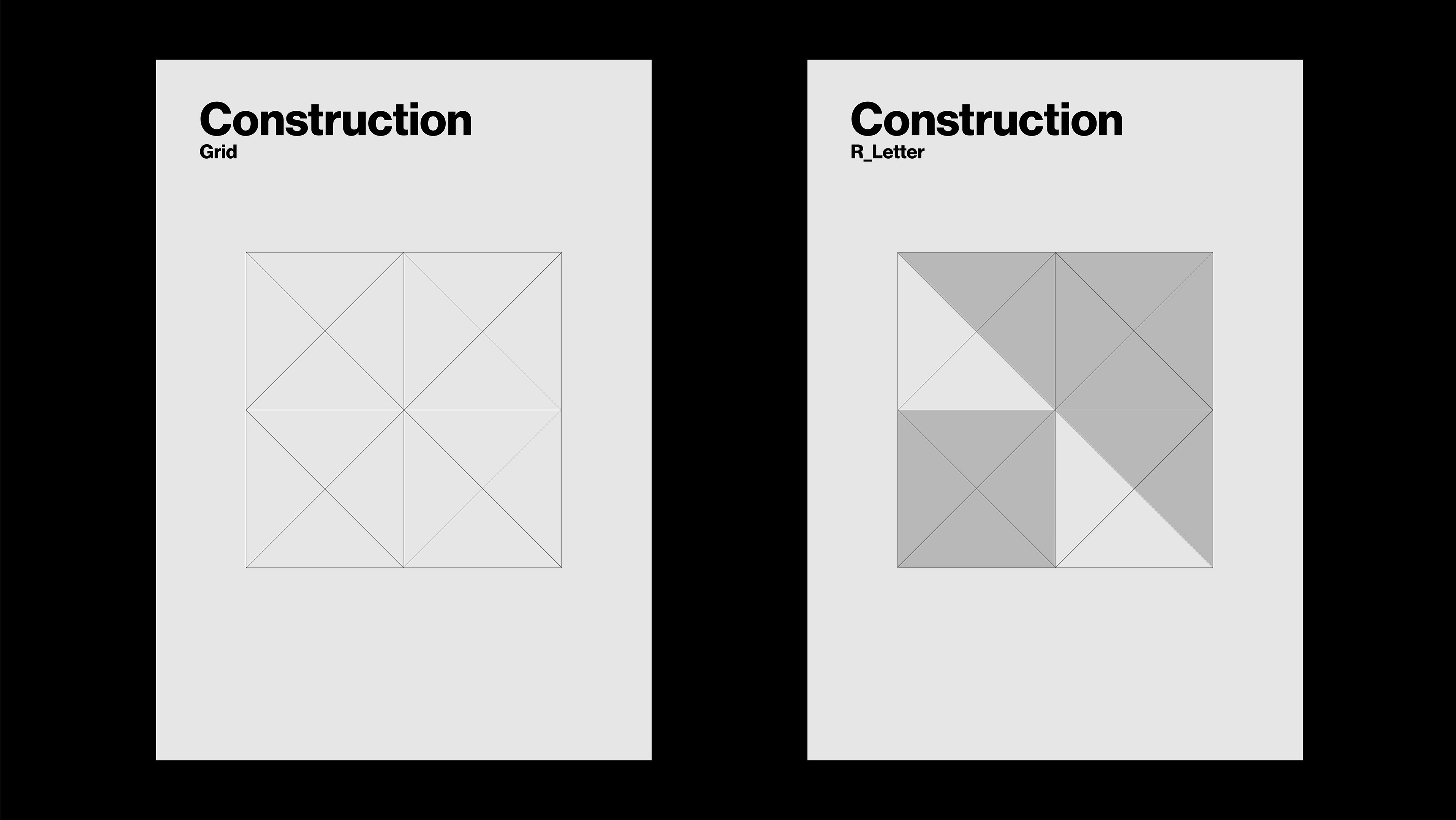
The logo for Weniger aber besser reflects the project’s minimalist essence through geometric precision and visual clarity. Built on a strict grid system, it uses simple shapes and a monochromatic palette to express order and intentionality. The typographic approach is clean and neutral, reinforcing the idea of timeless design. Without excess, the logo becomes a visual statement of balance, functionality, and quiet strength.