GCH
Sector
Vacation Rental Management
Services
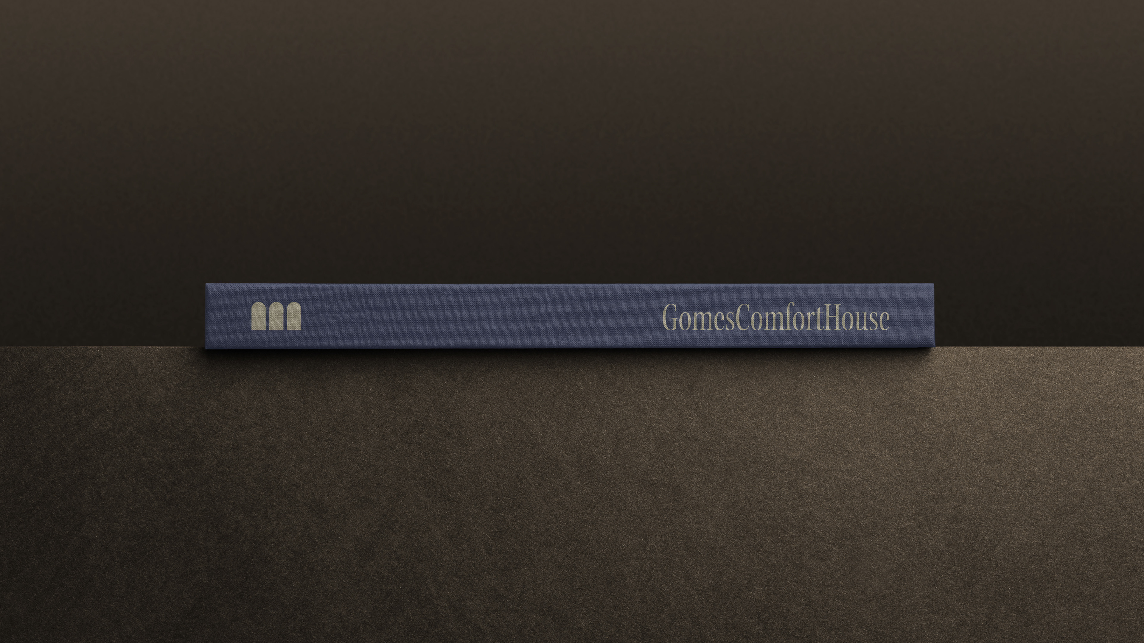
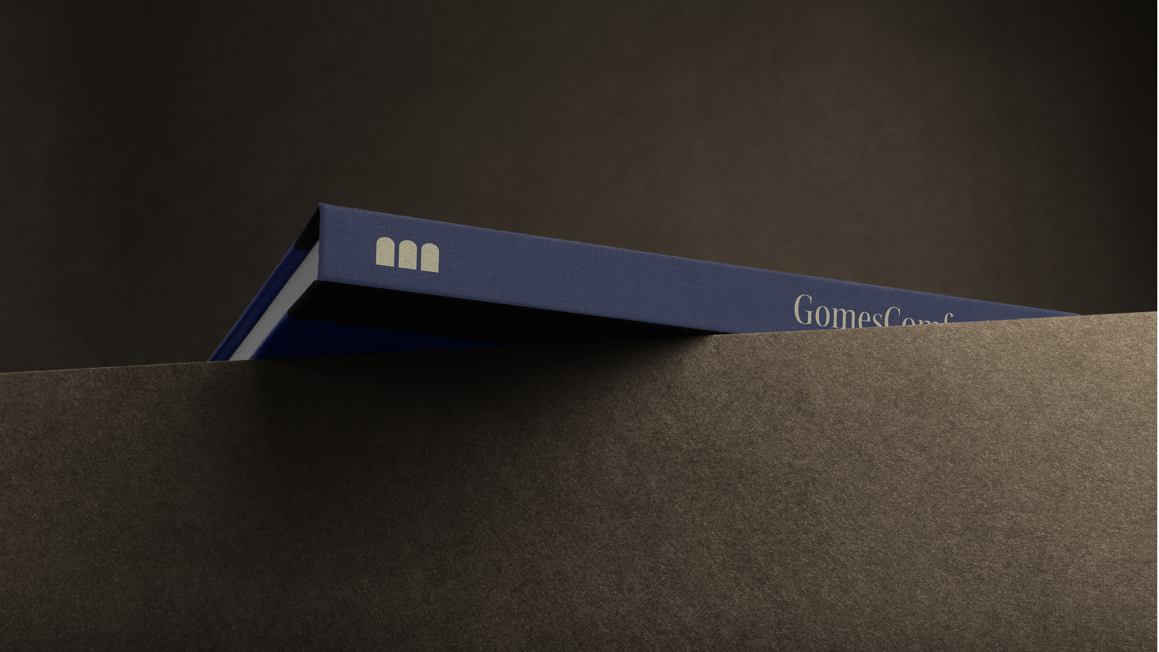
Logotype and Variations
Year
2024
Country
Italy
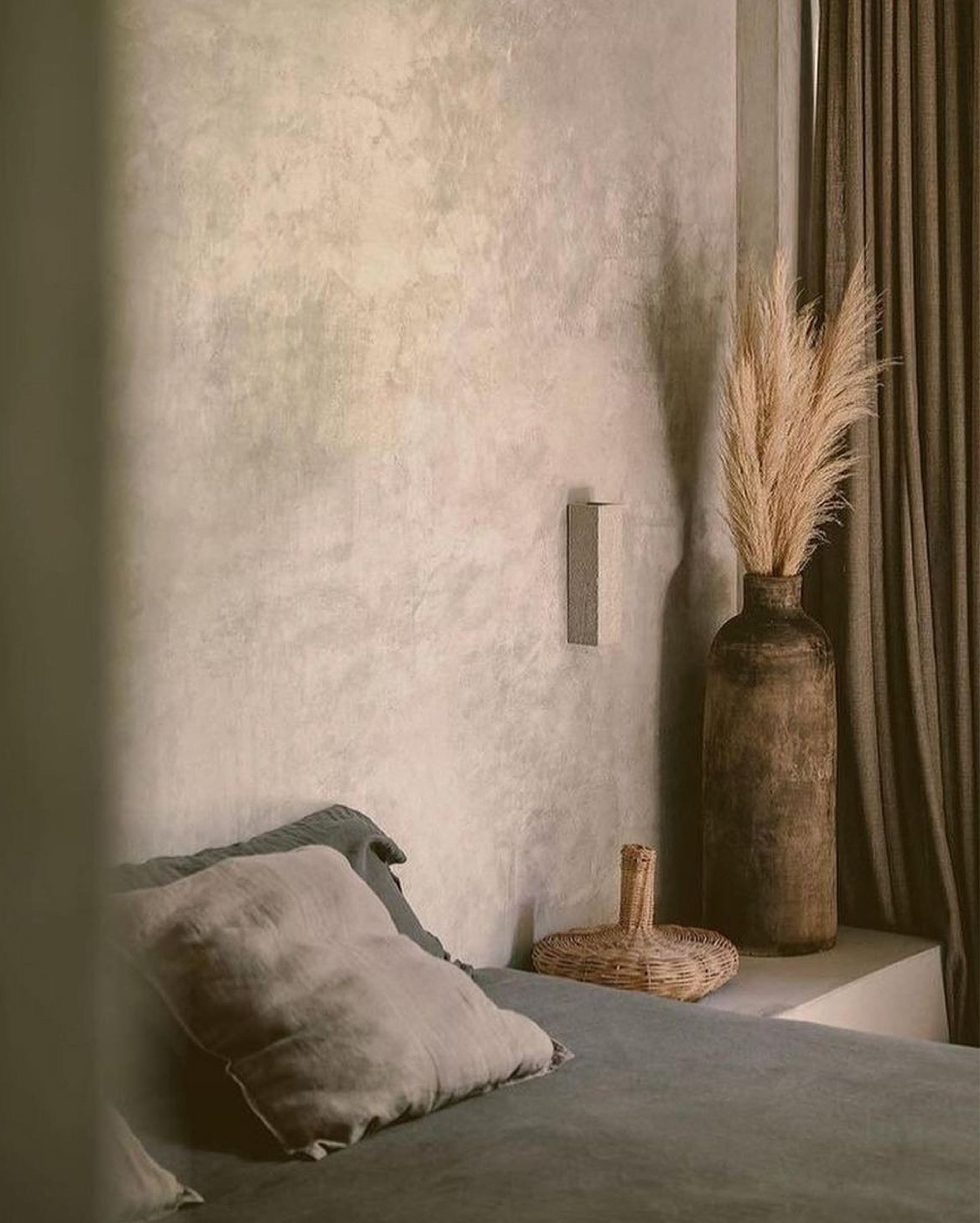
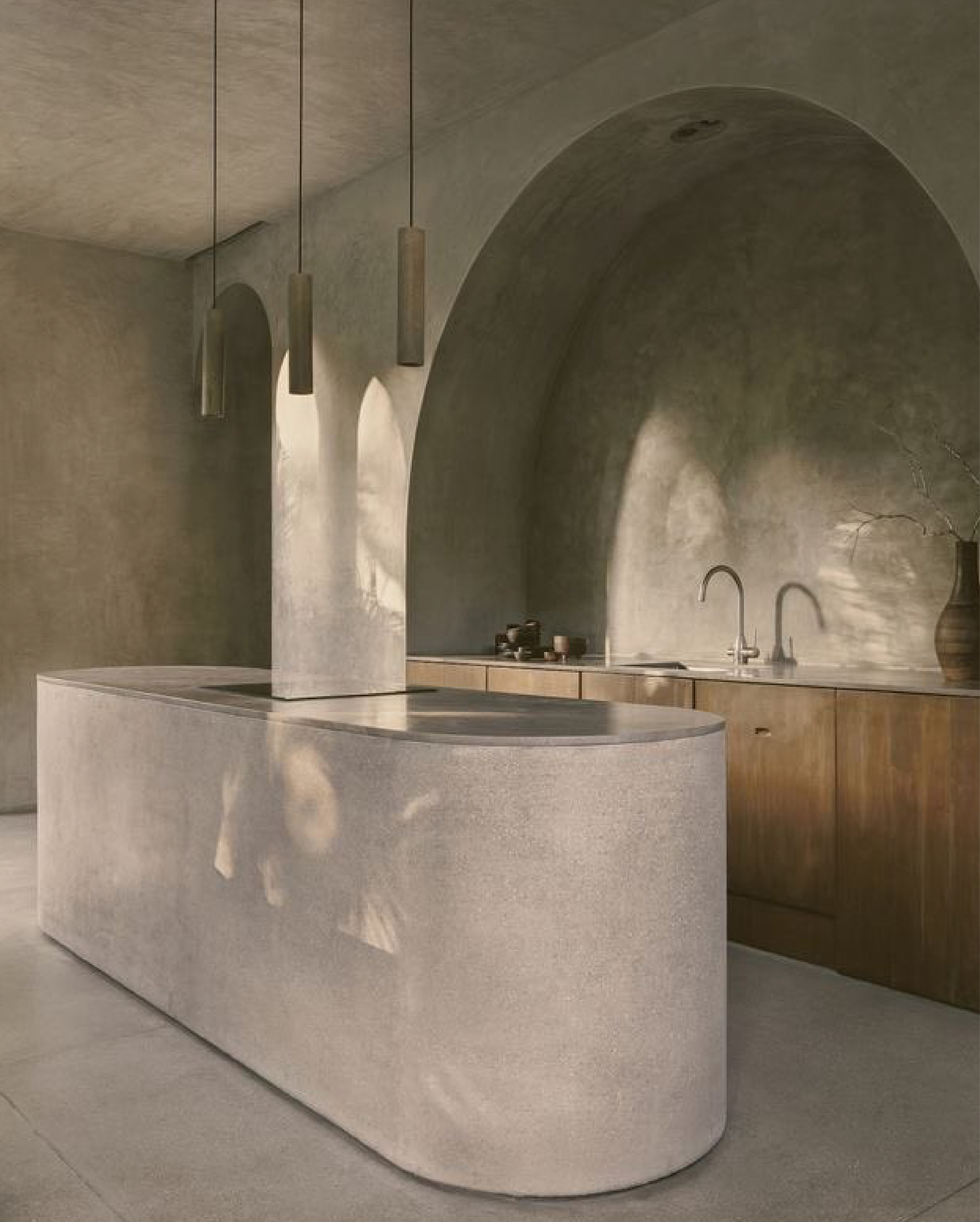
A clean and functional visual identity for an Italian hospitality brand, translating comfort, order, and warmth into simple, versatile forms.
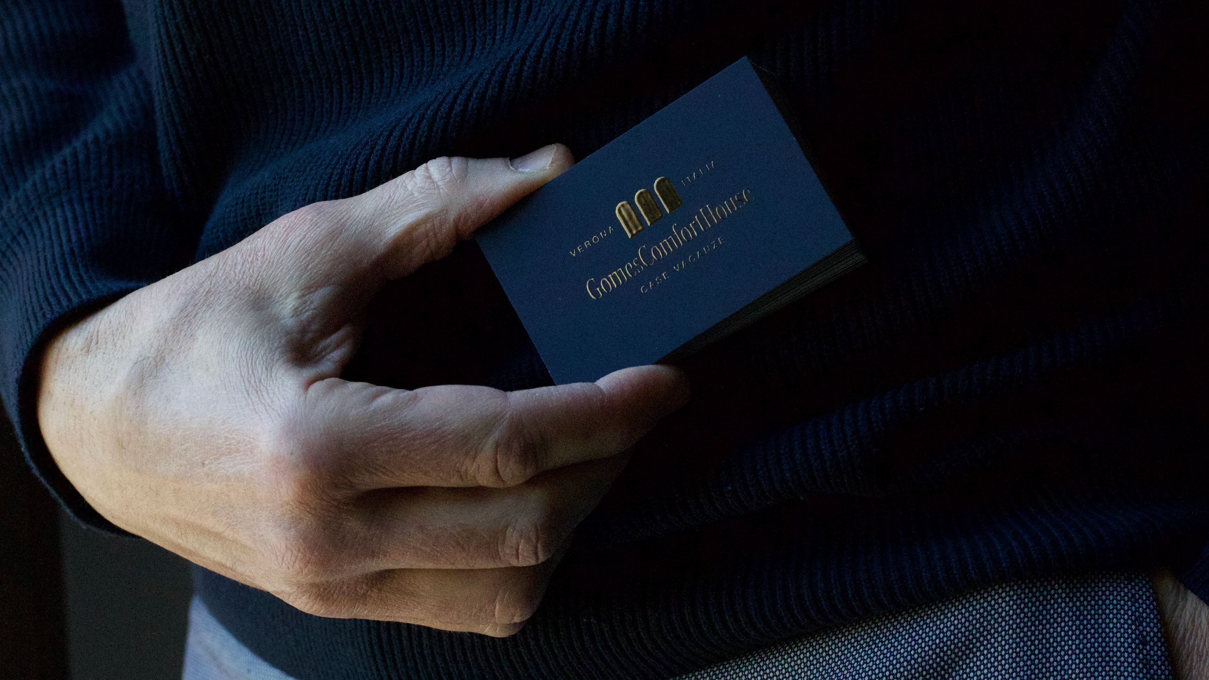
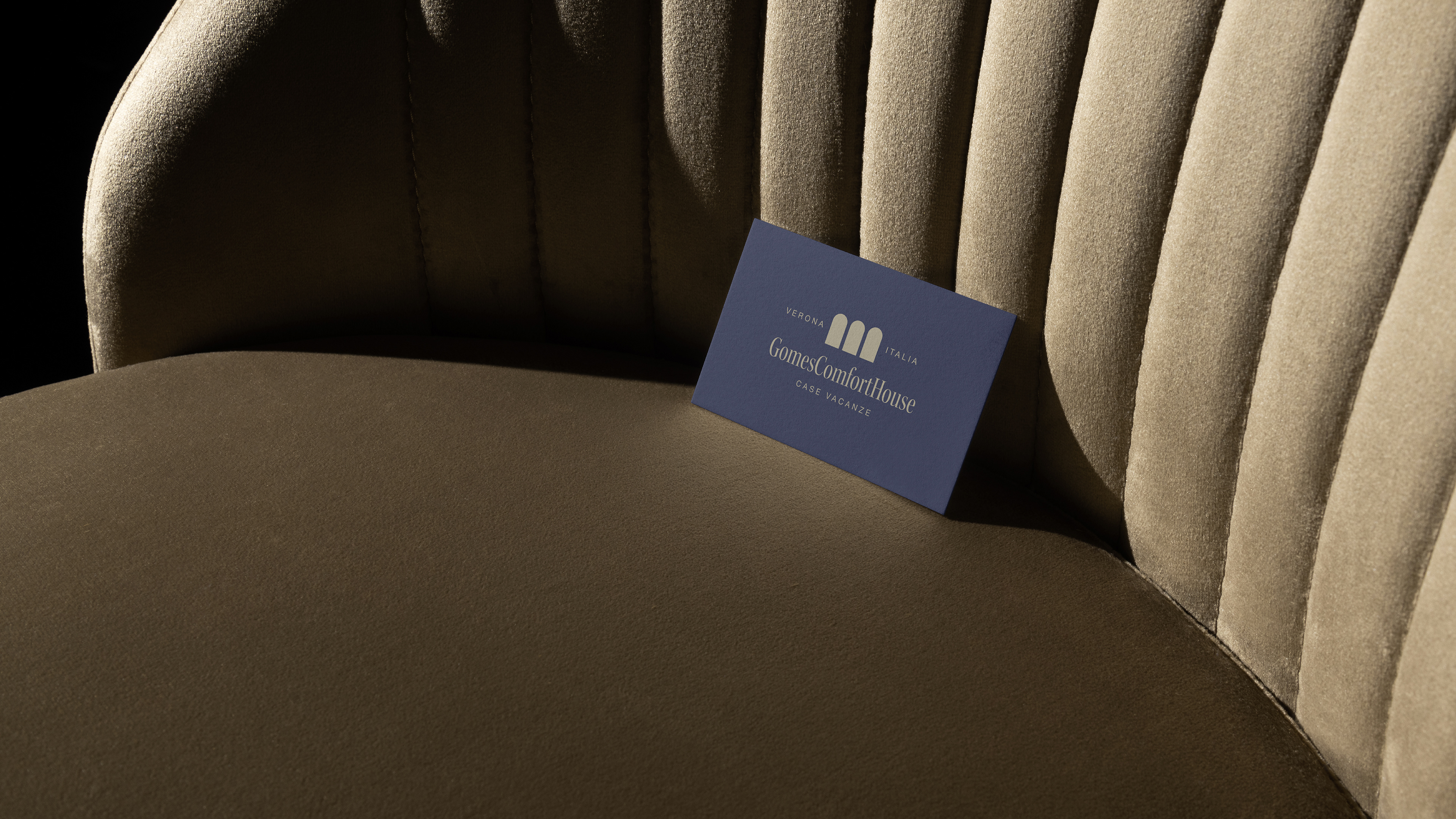
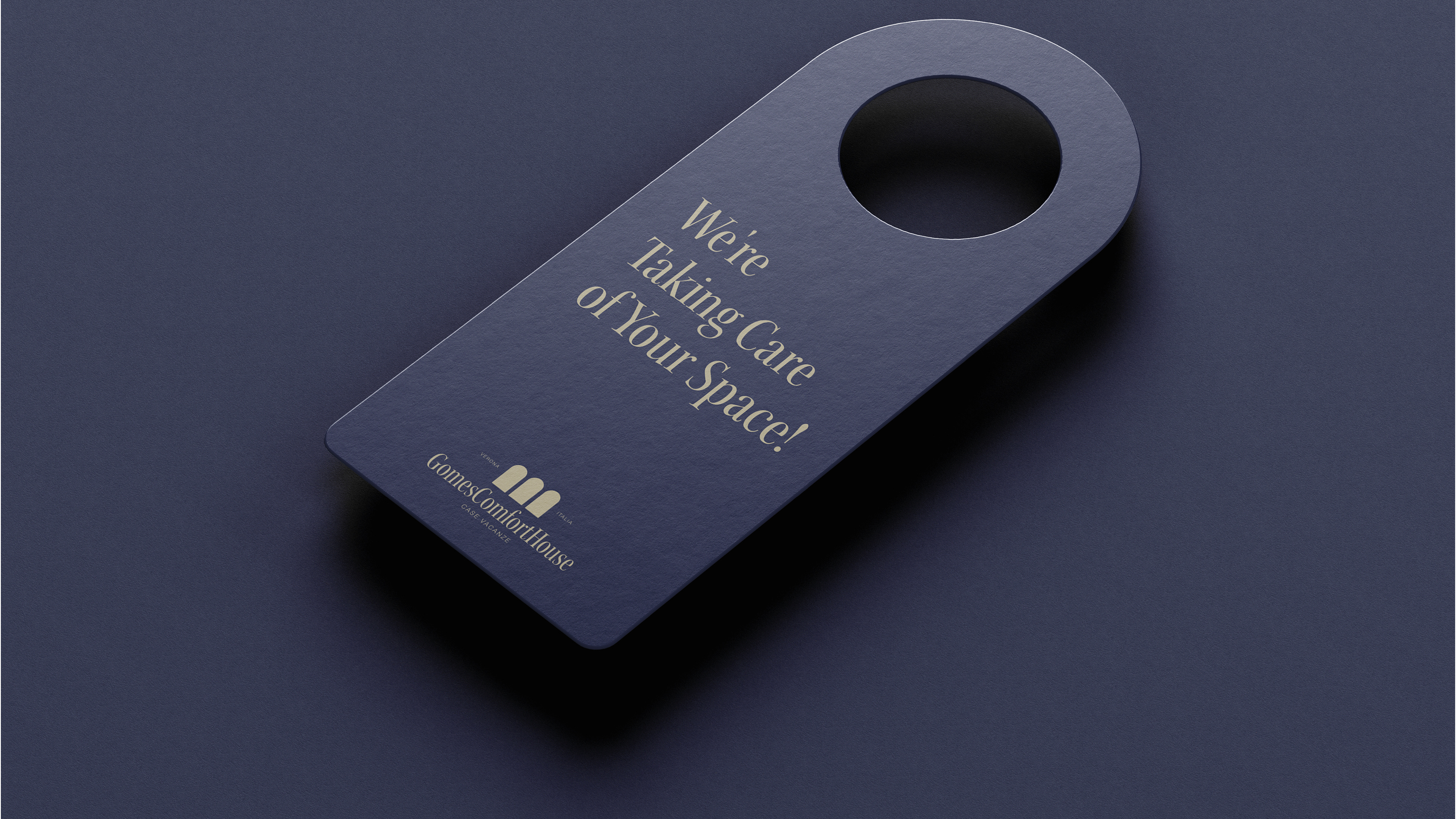
Gomes Comfort House is an Italian company specialized in short-term rentals, focused on providing guests with comfort, practicality, and a sense of welcome. The studio’s approach was to develop a visual identity that communicates these values with elegance, simplicity, and functional clarity.
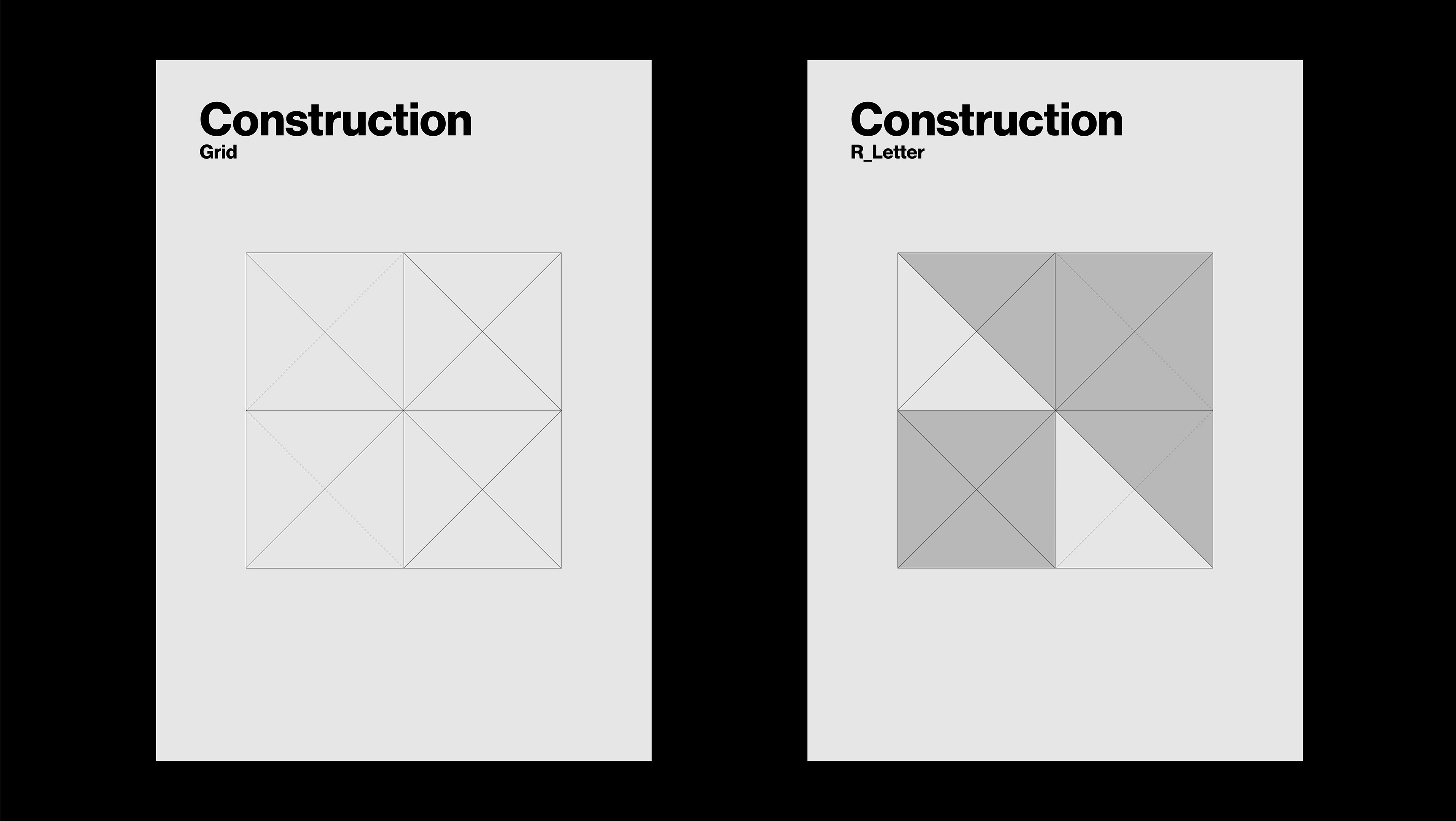
The logo was designed by combining the brand’s initials with soft, balanced geometric shapes, resulting in a minimalist and contemporary composition. The typographic choice and the proportions of the symbol convey a sense of order and reliability — key attributes in the hospitality market.
The visual system includes reduced and alternate logo versions for versatile usage, ensuring consistency across a wide range of applications — from business cards to digital platforms. A neutral, calming color palette reinforces the brand’s core message: providing memorable stays in well-prepared, welcoming spaces.